User Experience and Website Build
This organization is a secure supply chain company that is certified to work with a number of government agencies. They sought to provide a cutting-edge design to showcase their capabilities and to increase user interaction through their website.
The goals included:
1) Seamless brand incorporation
2) Mobile-first design
3) Clear map of user journey
Anacapa Micro
Redesigning user experience for government-contracting agency
GOAL: Create a new UX design and UI navigation system to improve usability and accessibility. Improve consistency with branding guidelines.
PROCESS: The process included a competitive analysis, UI kit, prototyping navigation flow, UX design iteration, mobile-responsive testing, and full build on staging site.
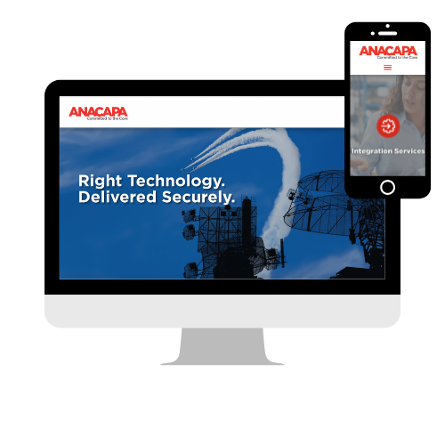
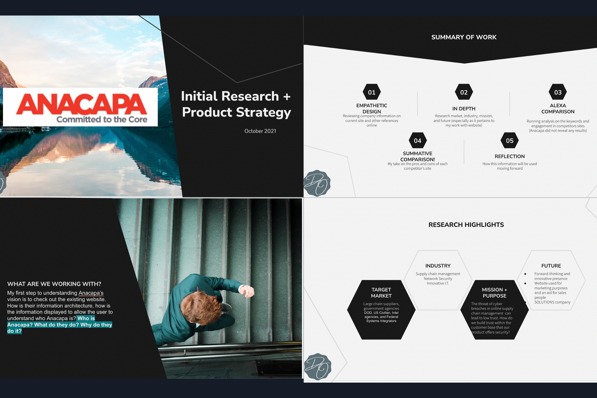
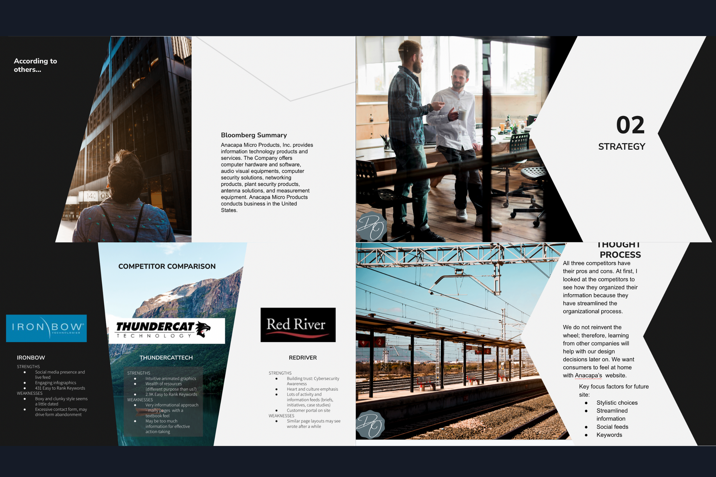
Initial Research & Product Strategy
The company aims to establish a forward-thinking and innovative presence, positioning itself as a solutions-driven organization. Its website serves both as a marketing tool and a resource for sales representatives, enhancing their ability to communicate value effectively.
Looking ahead, the company’s website will prioritize key factors to ensure an engaging and efficient user experience. Stylistic choices will reflect the brand’s modern and innovative identity, while streamlined information will improve navigation and accessibility. Integrating social media feeds will foster greater engagement and connectivity, and strategically incorporating keywords will enhance search visibility, ensuring the site reaches the right audience.
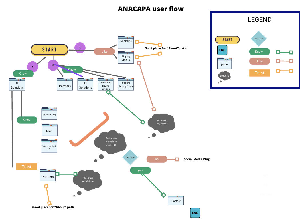
User Experience Whiteboarding and Initial User Flow
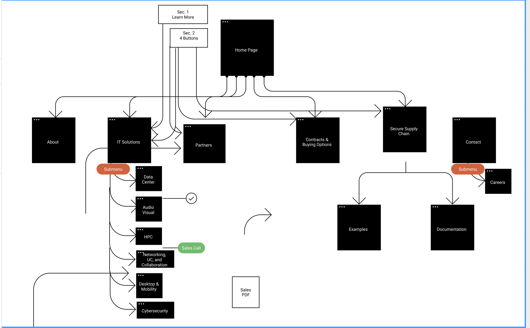
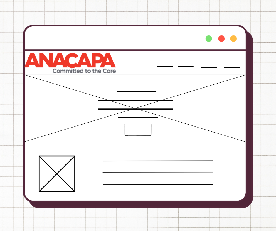
Using Figma, I worked with a team to develop ideas and solutions to. make a seamless user journey for visitors to the website. The site needed re-organization, as there is a lot of content that needs to be available, but not every user needs to see every specification of services.
We arrived at the basic organization to nest specific industry needs and coinciding certifications beneath I.T. Services, and users that needed additional information could use the top navigation to find their desired resource.
As the primary role of the website is to direct visitors to action, each footer contained a call to action and a way to get in touch.
Design Prototyping and Iteration
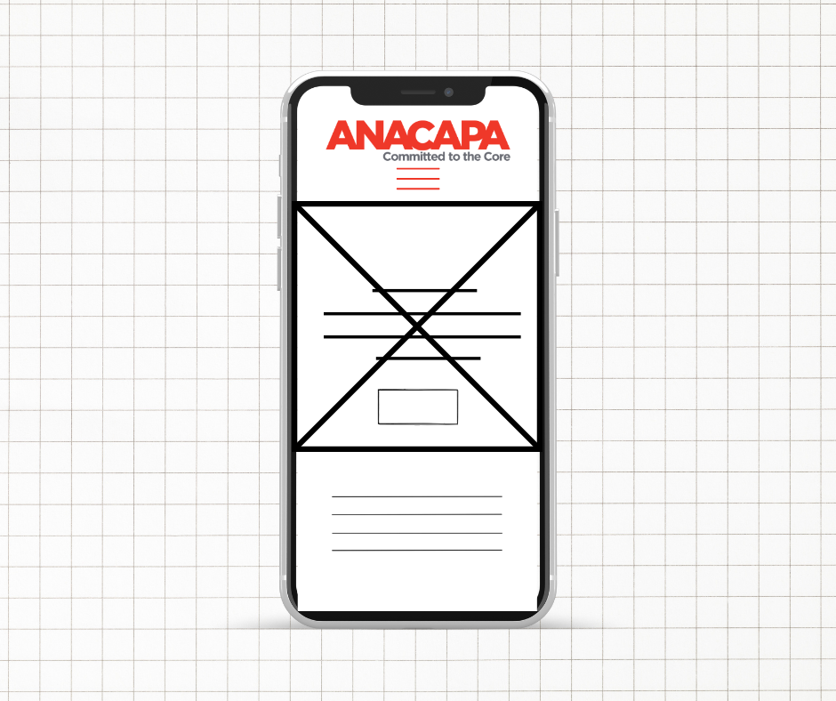
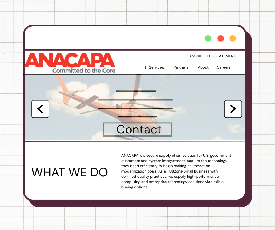
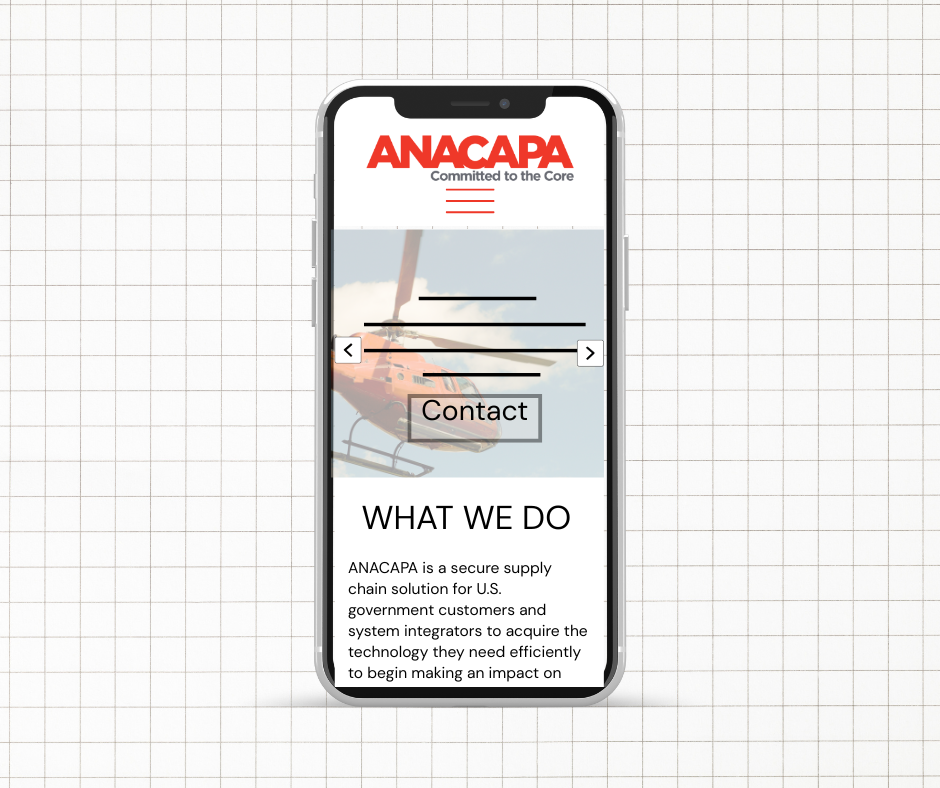
As we settled into our goals and necessary branding updates, I began creating wireframes and then prototypes in Figma for the website. These followed our proposed site map, and we conducted weekly virtual meetings to make adjustments and improvements on the initial designs.
UI Sticker Sheet & Style Guide
This UI kit presents a cohesive design system with a strong emphasis on bold typography, a red, black, and white color scheme, and a structured layout. The typography features Gotham Black Regular for headers, Gotham Bold for subheaders, and Roboto for paragraphs, ensuring readability and a modern aesthetic.
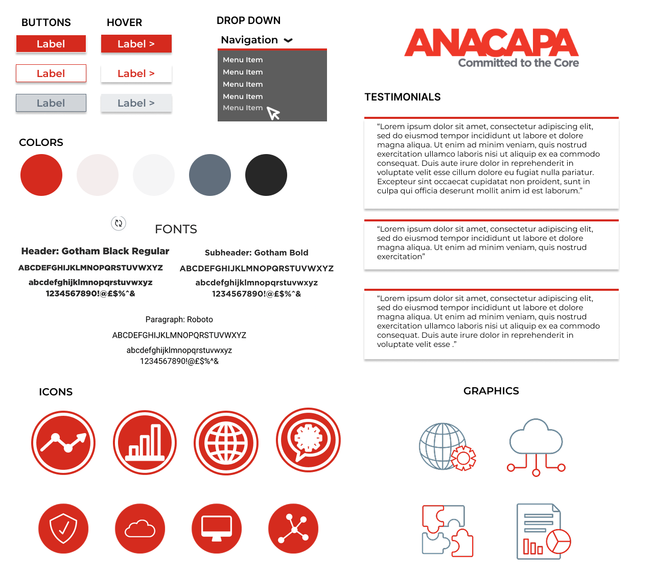
The color palette consists of red, white, gray, and black, creating a professional yet dynamic look. Buttons are designed with clear hover states, transitioning from gray or white backgrounds to a bold red focus. The dropdown menu follows a dark gray theme, reinforcing a sleek and high-contrast interface.
Icons and graphics are designed with a red and white outline style, maintaining brand consistency. The testimonial section is cleanly structured with gray and red accents, emphasizing user feedback. Overall, this UI kit ensures a strong, modern, and professional brand presence while maintaining usability and consistency across digital platforms.

Side Quest: Marketing Materials
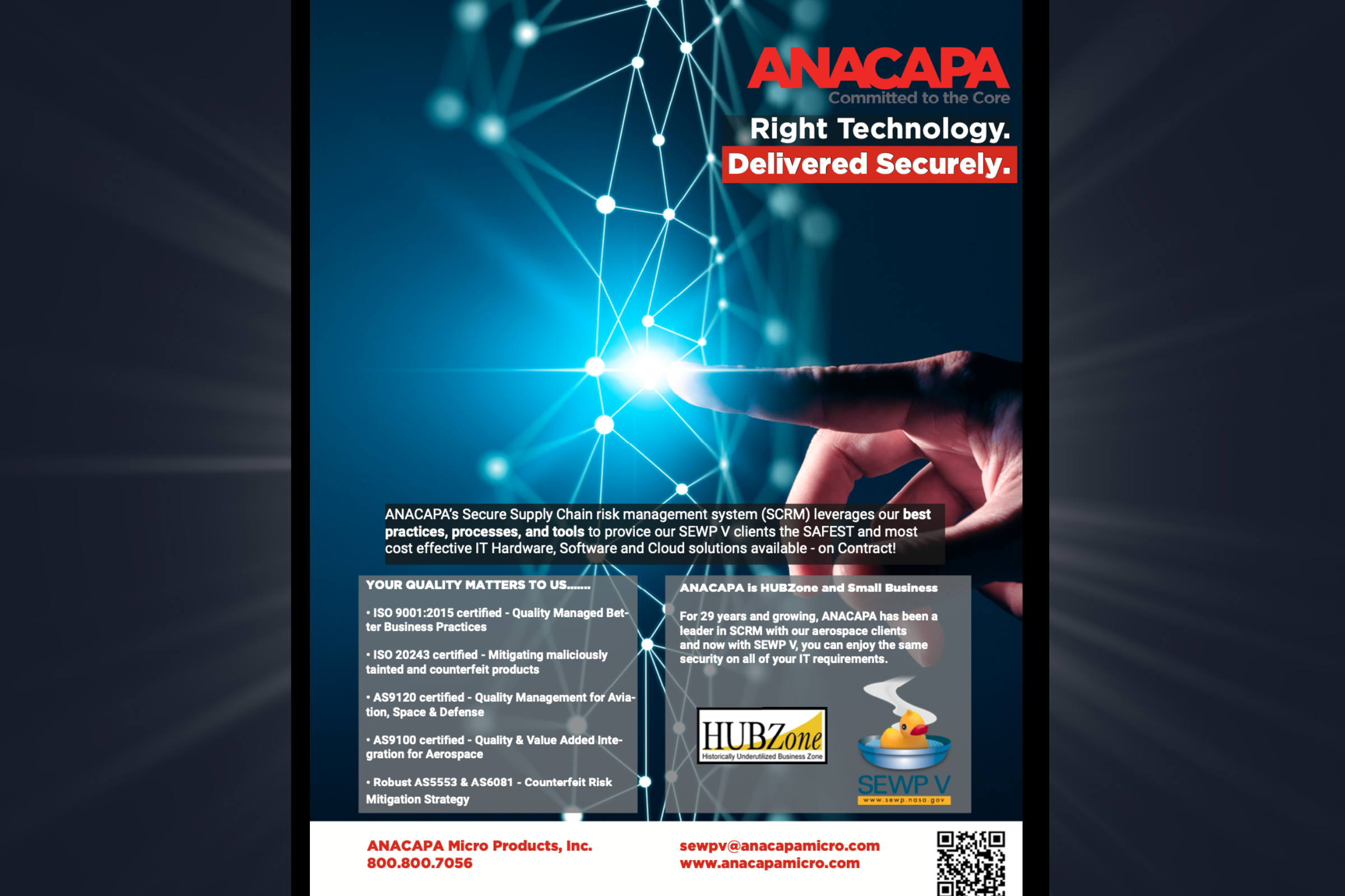
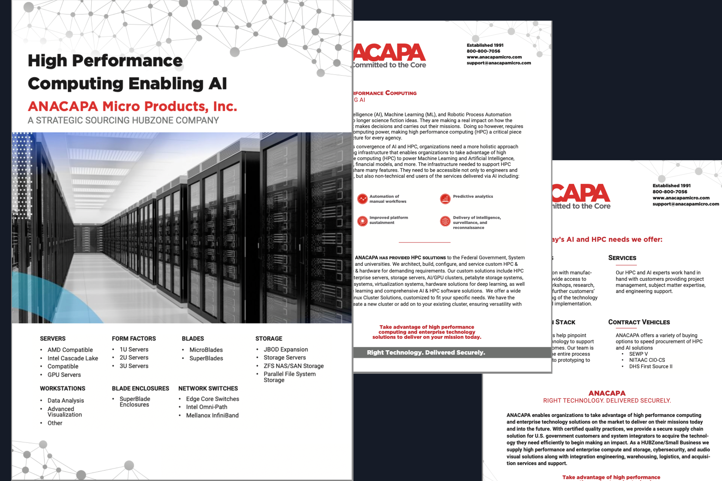
Throughout the project, additional needs for cutting-edge marketing materials arose. I worked together with the CEO and marketing manager to create a number of eye-catching designs for trade shows, brochures, and advertising using InDesign.

